Unlock the mysteries of the digital marketing world with our in-depth exploration of the crucial concept of a landing page.

Image courtesy of via DALL-E 3
Table of Contents
Introduction to Landing Pages
Welcome to the world of landing pages! Have you ever wondered what a landing page is and why it is important? Let’s dive into the exciting concept of landing pages in a way that’s easy for you to understand.
What is a Landing Page?
Imagine a landing page as a special part of a website designed for visitors to land on. It’s like a welcome mat that guides you to a specific purpose, such as signing up for something or learning about a product. It’s like the front door to a website with a clear mission!
Why Are Landing Pages Important?
Landing pages play a crucial role in helping people find what they are looking for quickly. They make it easy for visitors to understand the main message or action the website wants them to take. Think of landing pages as friendly signposts that lead you straight to the information or opportunity you’re seeking!
Types of Landing Pages
A click-through landing page is like a signpost that guides you to another part of a website. It’s helpful when you want to learn more about a product or service before making a decision.
Lead Generation Landing Pages
Lead generation landing pages ask for your contact information, like your email address, in exchange for something valuable. This could be a special offer, more information, or access to exclusive content.
Sales Landing Pages
Sales landing pages are designed to persuade you to buy a product or service directly from the page. They highlight the benefits of the offering and make it easy for you to make a purchase.
Designing an Effective Landing Page
When creating a landing page, it is essential to include key elements that will engage visitors and encourage them to take action. Let’s explore the important aspects of designing a landing page that works effectively.

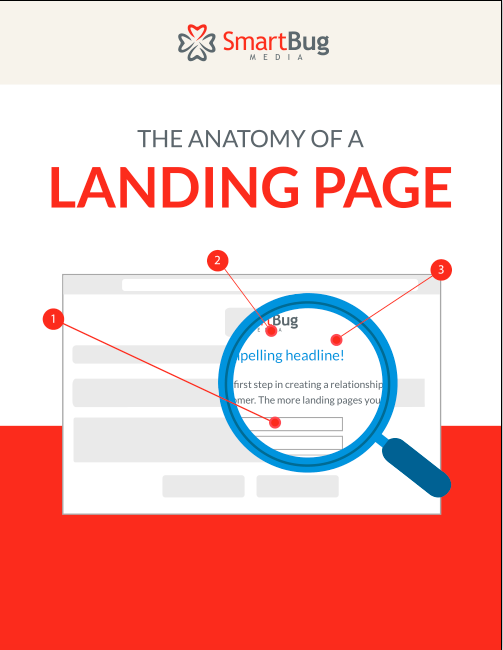
Image courtesy of www.smartbugmedia.com via Google Images
Clear Headline
A clear headline is like a signpost that tells visitors exactly what the page is about. It should be concise and descriptive, capturing the main message in just a few words. A strong headline can grab attention and entice visitors to stay on the page.
Engaging Images
Images play a crucial role in capturing visitors’ attention and conveying the main idea of the page quickly. Use high-quality, relevant images that are visually appealing and help communicate the message of the landing page. Visual elements can enhance the overall user experience and make the page more engaging.
Call-To-Action (CTA)
A Call-To-Action (CTA) button is a vital component of a landing page as it guides visitors on what action to take next. Whether it’s signing up for a service, downloading a resource, or making a purchase, the CTA should be clear, prominent, and compelling. Use action-oriented phrases like ‘Sign Up Now’ or ‘Learn More’ to prompt visitors to take the desired action.
Content for a Landing Page
When creating a landing page, it’s important to keep the content simple and easy to understand. Using simple words and short sentences can make the message clear for visitors. Complicated jargon or long paragraphs may confuse people and make them lose interest.
Focus on Benefits
One key aspect of writing content for a landing page is to focus on the benefits for the visitor. Clearly explain how they will benefit from what you are offering. Whether it’s a product, service, or information, make it clear how it will make their life easier, better, or more enjoyable.
Use Bullet Points
Including bullet points on your landing page can help break down information into easy-to-read segments. Visitors often scan content quickly, so having key points listed in bullet form can make it easier for them to grasp the main ideas without getting overwhelmed by large blocks of text.
Optimizing Your Landing Page
Once you have designed your landing page, it’s important to optimize it to make it more effective and easier for people to find online. Here are some key tips to improve your landing page:

Image courtesy of nicepage.com via Google Images
Use Keywords
Keywords are the important words that people might type into a search engine to find your page. Including relevant keywords in your landing page’s content and meta tags can help improve its visibility in search results.
Fast Loading Speed
Make sure your landing page loads quickly to prevent visitors from getting bored and leaving before the page fully loads. A fast loading speed can also improve your page’s search engine ranking.
Mobile-Friendly
With the growing number of people accessing the internet on their mobile devices, it’s crucial to ensure that your landing page is optimized for mobile viewing. Make sure the page layout and design look good and work well on phones and tablets.
Examples of Great Landing Pages
One example of a great landing page is Nike’s website. When you land on the page, you immediately see a clear headline that says, “Just Do It.” This headline is engaging and instantly lets you know what Nike is all about. The page also features high-quality images of their products, showcasing the latest styles and designs. The call-to-action buttons are prominent and encourage visitors to explore and shop for their favorite items.
Another effective brand landing page is Airbnb’s homepage. The headline, “Live Anywhere,” quickly conveys the message of unique travel experiences. The page includes stunning images of different accommodations, enticing visitors to learn more and book their next stay. The use of personalized recommendations and social proof adds to the overall appeal and encourages trust in the brand.
Small Business Success
A small business that has excelled in creating a great landing page is a local bakery called Sweet Delights. Their landing page features a clear headline, “Indulge in Sweet Moments,” which immediately captures the essence of their brand. The page includes mouth-watering images of their delicious treats, along with a simple form to sign up for their newsletter and receive exclusive offers.
Another example of a successful small business landing page is a yoga studio named Zen Flow. The headline, “Find Your Inner Peace,” sets the tone for a calming and rejuvenating experience. The page includes serene images of yoga poses and nature, creating a tranquil atmosphere. The call-to-action button prompts visitors to sign up for a free trial class, making it easy for them to take the next step in their wellness journey.
Common Mistakes to Avoid
One common mistake people make when creating landing pages is using too many words. Visitors don’t want to read through paragraphs of text to find the information they need. Keep your message clear and concise. Use simple words and short sentences to get your point across quickly.
.jpg?width=1200&name=LeanLabs-2%20(1).jpg)
Image courtesy of www.lean-labs.com via Google Images
No Clear CTA
Another mistake to avoid is not having a clear call-to-action (CTA) on your landing page. If your visitors don’t know what action to take next, they are likely to leave without completing the desired goal. Make sure your CTA stands out and tells visitors exactly what you want them to do, whether it’s signing up for a newsletter, making a purchase, or requesting more information.
Poor Design
A messy or unattractive design can also drive people away from your landing page. Make sure your page is visually appealing and easy to navigate. Use engaging images, clear headlines, and a well-placed CTA button to guide visitors through the page. A clean and professional design will help establish credibility and keep visitors engaged with your content.
Conclusion and Summary
In this blog article, we learned that a landing page is like a special section of a website with a specific purpose, such as signing up for something or learning about a product. Landing pages are important because they help visitors quickly find what they are looking for and understand the main message or action.
There are different types of landing pages, including click-through pages, lead generation pages, and sales pages, each serving a specific function. When designing an effective landing page, key elements like a clear headline, engaging images, and a compelling Call-to-Action (CTA) button are crucial.
Good content for a landing page should be simple, focused on benefits, and presented using bullet points for clarity. Optimizing a landing page involves using relevant keywords, ensuring fast loading speed, and making the page mobile-friendly to enhance its visibility and user experience.
Final Thoughts
Creating a successful landing page requires attention to detail and a clear understanding of the audience’s needs. By avoiding common mistakes like excessive text, unclear CTAs, and poor design, you can increase the effectiveness of your landing page.
As you explore the world of landing pages further, remember to keep these important tips in mind. You can experiment with different designs, content strategies, and CTAs to see what works best for your specific goals. So go ahead, try making your own landing pages and watch as they help you achieve your desired results!
Want to turn these SEO insights into real results? Seorocket is an all-in-one AI SEO solution that uses the power of AI to analyze your competition and craft high-ranking content.
Seorocket offers a suite of powerful tools, including a Keyword Researcher to find the most profitable keywords, an AI Writer to generate unique and Google-friendly content, and an Automatic Publisher to schedule and publish your content directly to your website. Plus, you’ll get real-time performance tracking so you can see exactly what’s working and make adjustments as needed.
Stop just reading about SEO – take action with Seorocket and skyrocket your search rankings today. Sign up for a free trial and see the difference Seorocket can make for your website!
Frequently Asked Questions (FAQs)
What is a Landing Page?
A landing page is like a special part of a website for visitors to land on. It usually has a specific purpose, like getting you to sign up for something or learn about a product.
How Do I Make a Landing Page?
To create a landing page, you can start by designing a clear headline that tells visitors what the page is about. Use engaging images to grab attention, and include a clear Call-To-Action (CTA) button that tells visitors what to do next, like ‘Sign Up Now’ or ‘Learn More’.
Why is My Landing Page Not Working?
If your landing page is not performing well, there could be a few common reasons. Perhaps there is too much text on the page, which can confuse visitors. Another reason could be that there is no clear Call-To-Action (CTA), so visitors don’t know what to do. Additionally, poor design or layout can drive people away from your page. It’s important to keep these factors in mind when creating and optimizing your landing page.


