Unlock the secrets of boosting your SEO with the Viewport Meta Tag – your key to higher search engine rankings!

Image courtesy of via DALL-E 3
Table of Contents
Introduction to the Viewport Meta Tag
In the vast world of the internet, websites come in all shapes and sizes. Some are designed for desktop computers, while others are optimized for mobile devices like smartphones and tablets. Have you ever wondered how a webpage knows how to fit on your screen just right, no matter what device you’re using? That’s where the Viewport Meta Tag comes in!
What is a Viewport?
Imagine a viewport as a window into the world of a webpage. It’s the area of a web page that you can see on your screen at one time. When you pinch and zoom on your phone or scroll up and down, you’re interacting with the viewport. In simple terms, the viewport is like a frame that shows you a specific part of a webpage at any given moment.
What is a Meta Tag?
Now, let’s talk about meta tags. These are like hidden helpers for search engines and web browsers. A meta tag is a snippet of HTML code that tells search engines what a webpage is all about. It provides information about the content, keywords, and other details that help search engines understand and categorize the page better.
Why Viewport Meta Tag is Important for SEO
Implementing the viewport meta tag is crucial for improving a website’s SEO (Search Engine Optimization) and enhancing the overall user experience. Let’s delve into why this simple snippet of code can significantly impact a site’s performance on search engines and on different devices.
Enhancing Mobile Experience
When browsing the internet on a smartphone or tablet, users expect websites to adapt to the smaller screen size and display content seamlessly. By using the viewport meta tag, web developers can ensure that their site looks and functions well on various devices, providing a positive user experience. This, in turn, reduces bounce rates and keeps visitors engaged with the content.
Boosting Search Engine Rankings
Search engines like Google prioritize mobile-friendly websites in their rankings, as they aim to deliver the best user experience to their users. By implementing the viewport meta tag and optimizing the website for mobile devices, developers can improve their chances of ranking higher in search results. This can lead to increased visibility, more organic traffic, and ultimately, better SEO performance for the website.
How to Implement the Viewport Meta Tag
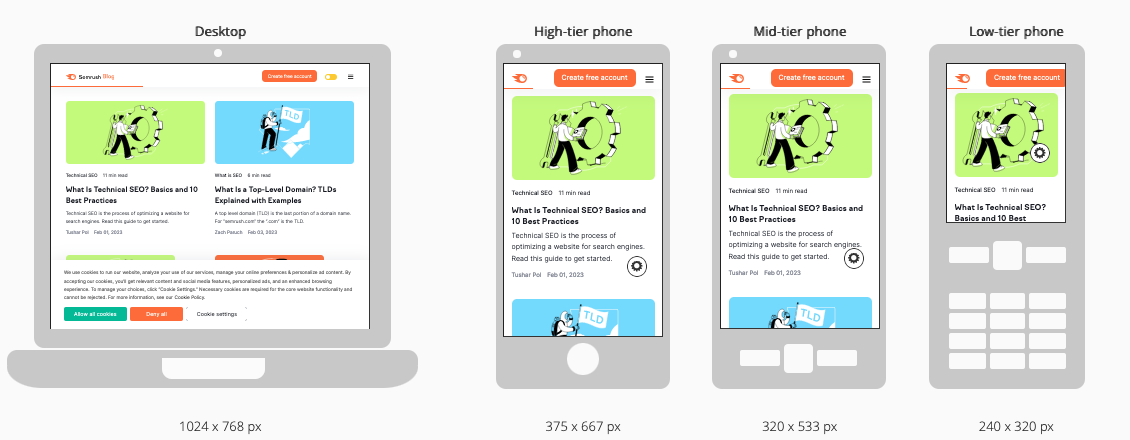
The viewport meta tag is a crucial element in making your website responsive and mobile-friendly. To implement the viewport meta tag on your website, you need to add a specific line of code to the head section of your HTML document.

Image courtesy of www.semrush.com via Google Images
Here is the basic code snippet you need to insert:
“`html
“`
This code tells the browser to set the width of the viewport to the device width and to start with an initial zoom level of 1.0, ensuring that your website looks great on all screen sizes.
Common Values and Attributes
While the basic code snippet provided above is a good starting point, you can customize the viewport meta tag further by using different values and attributes to achieve specific effects.
Here are some common values and attributes you can use along with the viewport meta tag:
- width: Sets the width of the viewport to a specific value or the device width.
- height: Sets the height of the viewport to a specific value.
- initial-scale: Sets the initial zoom level when the page is loaded.
- minimum-scale: Sets the minimum zoom level allowed for the page.
- maximum-scale: Sets the maximum zoom level allowed for the page.
- user-scalable: Controls whether users can zoom in and out of the page.
By experimenting with these values and attributes, you can tailor the viewport meta tag to suit your website’s specific design and responsiveness needs.
Testing the Viewport Meta Tag
One way to test if the viewport meta tag is working correctly on a website is by using browser developer tools. These tools allow web developers to inspect the elements of a webpage and see how they appear on different screen sizes. By adjusting the viewport size within the browser developer tools, developers can simulate how the website will look on various devices, such as mobile phones or tablets.
Online Tools for Checking
Online tools are also available to help check if a website is mobile-friendly and if the viewport meta tag is set up correctly. These tools analyze a website’s responsiveness and provide insights into how it appears on different devices. By entering a website’s URL into these tools, developers can receive recommendations on how to improve the mobile-friendliness of their site and ensure that the viewport meta tag is functioning as intended.
Best Practices for Viewport Meta Tag
The viewport meta tag should be used consistently on every page of a website to ensure a uniform and optimal user experience across all devices. By including the viewport meta tag in the HTML code of every page, web developers can guarantee that their website is responsive and adaptable to various screen sizes.

Image courtesy of www.semrush.com via Google Images
Avoiding Common Mistakes
When implementing the viewport meta tag, it is essential to avoid common mistakes that can hinder its effectiveness. One common error is setting incorrect values for the viewport attributes, leading to display issues on different devices. To prevent this, it is crucial to understand the purpose of each attribute and use them appropriately.
Real-World Examples
Many popular websites have utilized the viewport meta tag to enhance their user experience and improve SEO. For example, Amazon, one of the largest e-commerce platforms, optimizes its website for various screen sizes through the viewport meta tag. This allows Amazon’s pages to adapt seamlessly to different devices, providing a smooth shopping experience for users on desktops, smartphones, and tablets.
Another notable example is the news website BBC News. By incorporating the viewport meta tag, BBC News ensures that its articles and multimedia content are displayed correctly on screens of all sizes. This not only enhances user engagement but also contributes to better search engine visibility, ultimately driving more traffic to their site.
Before and After
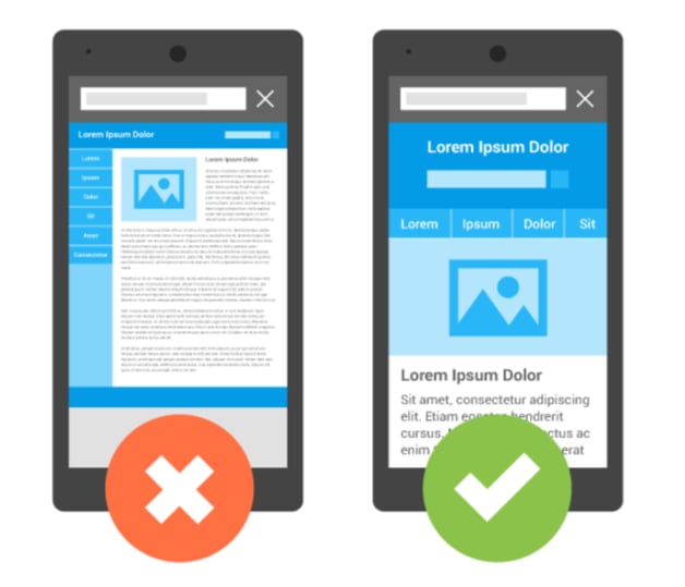
Let’s consider a case study of a local bakery’s website. Before implementing the viewport meta tag, the bakery’s site appeared distorted and hard to navigate on mobile devices, leading to a high bounce rate and low conversion rates. However, after adding the viewport meta tag with proper settings, the website became mobile-friendly and responsive, resulting in a significant increase in mobile traffic, longer average session durations, and a boost in online orders.
This before-and-after transformation highlights the tangible benefits of utilizing the viewport meta tag to create a user-centric and search engine-friendly website that caters to the diverse needs of modern consumers.
Common Issues and Troubleshooting
One common issue you may encounter when using the viewport meta tag is that your website may not scale correctly on different devices. This can result in elements appearing too small or too large on the screen, making the user experience less than optimal.

Image courtesy of www.seoclarity.net via Google Images
To fix this problem, make sure you have set the initial-scale attribute correctly in your viewport meta tag. The initial-scale value determines the zoom level at which your website is displayed when first loaded. Experiment with different values until you find the one that makes your website scale appropriately on various devices.
Conflicts with Other Tags
Another issue that may arise with the viewport meta tag is conflicts with other tags or scripts on your webpage. This can happen if there are conflicting instructions regarding the viewport in different parts of your HTML code.
To address this problem, ensure that there are no conflicting viewport settings in your CSS files or JavaScript code that may override the viewport meta tag. Check for any other meta tags or viewport-related CSS rules that could be interfering with the intended behavior of the viewport meta tag. By resolving these conflicts, you can ensure that the viewport meta tag works as intended without any disruptions.
Conclusion
In conclusion, the viewport meta tag plays a crucial role in enhancing both SEO and user experience on websites. By ensuring that your website is mobile-friendly and responsive, you can attract more visitors and improve your search engine rankings. Implementing the viewport meta tag is a simple yet powerful way to optimize your site for a diverse range of devices, from smartphones to tablets.
Remember, the key points to take away from this article are the importance of understanding what a viewport is in web design, the significance of meta tags in helping search engines interpret your content, and the practical steps for implementing and testing the viewport meta tag on your website. By following best practices and avoiding common mistakes, you can ensure that your site is fully optimized for users across various platforms.
Want to turn these SEO insights into real results? Seorocket is an all-in-one AI SEO solution that uses the power of AI to analyze your competition and craft high-ranking content.
Seorocket offers a suite of powerful tools, including a Keyword Researcher to find the most profitable keywords, an AI Writer to generate unique and Google-friendly content, and an Automatic Publisher to schedule and publish your content directly to your website. Plus, you’ll get real-time performance tracking so you can see exactly what’s working and make adjustments as needed.
Stop just reading about SEO – take action with Seorocket and skyrocket your search rankings today. Sign up for a free trial and see the difference Seorocket can make for your website!
Frequently Asked Questions (FAQs)
What Happens if I Don’t Use the Viewport Meta Tag?
If you choose not to use the viewport meta tag on your website, it may not display properly on various devices. Without the viewport meta tag, the webpage’s content might appear zoomed out, making it difficult for users to read or interact with. This can lead to a poor user experience and potentially lower search engine rankings since search engines favor mobile-friendly websites.
Can I Change the Viewport Meta Tag Later?
Yes, you can update the viewport meta tag on your website even after it has gone live. Web developers can easily access the HTML code of a webpage to make adjustments to the viewport meta tag. By making changes to the viewport meta tag, you can improve how your website appears and functions on different devices, enhancing user experience and potentially boosting your site’s SEO performance.


