Uncover the secret to website success with this must-read blog post on the critical role of Above the Fold.

Image courtesy of via DALL-E 3
Table of Contents
Welcome, young reader, to a fascinating exploration into the world of websites and why something called “above the fold” is crucial for their success. Have you ever wondered why some websites immediately catch your attention while others don’t? Well, it all starts with what you see at the top of a webpage, or what we call “above the fold”. Let’s dive in and discover why this area plays a vital role in creating a great first impression for visitors like you!
What Does ‘Above the Fold’ Mean?
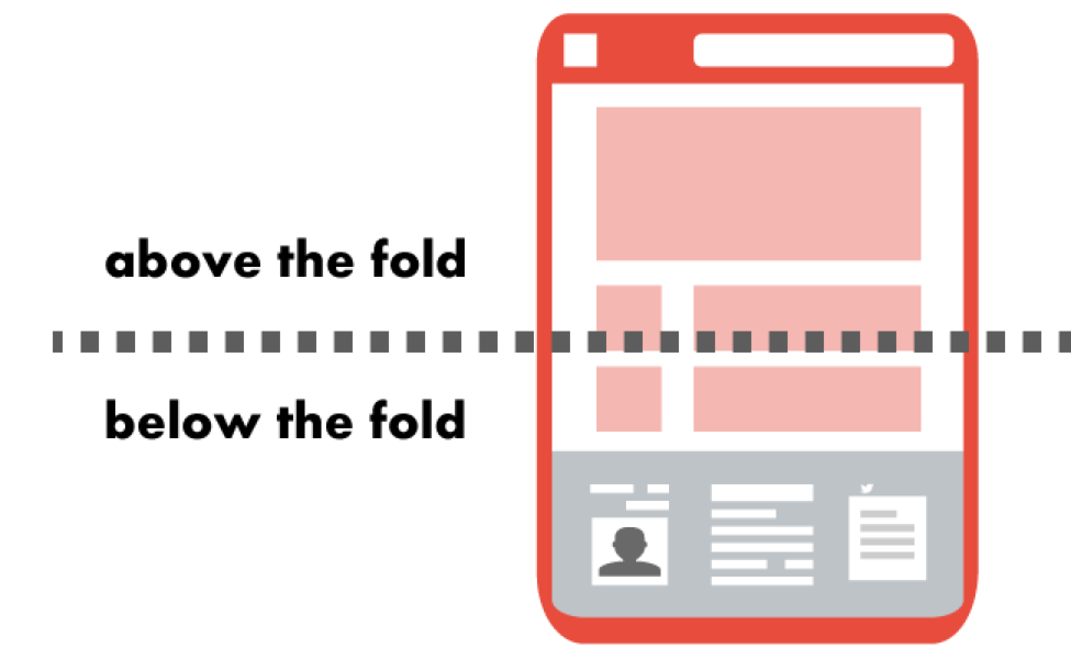
Imagine holding a newspaper folded in half. The top half that you see without unfolding it is called “above the fold”. This concept comes from newspapers, but it’s equally important for websites. Above the fold on a website is the part that appears on your screen without scrolling, making it the first thing visitors see when they land on a webpage.
Why First Impressions Matter
Just like meeting someone for the first time, a website’s first impression can make all the difference. When you visit a website, you quickly decide if you want to stay and explore more or if you’ll leave and look elsewhere. That’s why what’s placed above the fold is so crucial—it needs to grab your attention and make you want to stay and discover what the website has to offer.
Key Elements Above the Fold
Headers and Logos
Headers and logos play a crucial role in branding and creating a strong identity for a website. The header is like a welcome sign that tells visitors what your site is all about. It should be eye-catching and memorable. A logo is a visual representation of your brand and helps users quickly identify and remember your site.
Navigation Menus
A clear and simple navigation menu is essential above the fold. This menu helps users easily find their way around your site. It should be intuitive and guide visitors to the most important pages. A confusing or cluttered navigation menu can frustrate users and make them leave your site.
Call-to-Action (CTA)
A Call-to-Action, or CTA, is a button or link that prompts visitors to take a specific action, such as signing up for a newsletter or making a purchase. Placing a CTA above the fold can significantly increase conversions. Make sure your CTA stands out and clearly communicates what you want visitors to do.
Eye-catching Images
Images are a powerful tool for capturing visitors’ attention and conveying your message quickly. High-quality, relevant images or graphics above the fold can make a strong impact on visitors. They can evoke emotions, explain concepts, or showcase products or services, all of which can engage users and keep them on your site.
Engaging Content
In the bustling world of websites, it’s essential to capture the attention of visitors quickly. One way to do this is by creating engaging content that entices people to explore more. Let’s dive into the importance of crafting captivating headlines, interesting subheadings, and keeping your paragraphs short and sweet.
Captivating Headlines
Headlines are like the front door to a house – they should be inviting and make you curious to step inside. When creating headlines for your website, think about what would grab your attention. Use exciting words, ask questions, or make bold statements to pique the curiosity of your visitors. Remember, the headline is the first thing people see, so make it count!
Interesting Subheadings
Subheadings are like signposts that guide readers through your content. They break up long chunks of text and make it easier for people to scan and find what they’re looking for. By using descriptive subheadings, you can keep your audience engaged and interested in exploring more of what you have to offer.
Short and Sweet Paragraphs
Long paragraphs can be overwhelming and cause readers to lose interest. That’s why it’s crucial to keep your paragraphs short and to the point. By breaking up your content into bite-sized chunks, you make it easier for people to digest the information. Remember, simplicity is key when it comes to engaging your audience above the fold.
User Experience (UX)
In the world of websites, user experience (UX) plays a crucial role in ensuring visitors have a seamless and enjoyable time navigating through a site. Let’s explore how a great UX can enhance the above-the-fold area and overall website effectiveness.

Image courtesy of www.abtasty.com via Google Images
Simple and Clean Design
When it comes to the design above the fold, less is often more. A simple and clean layout can help visitors focus on the most important elements, such as your headline, call-to-action button, and navigation menu. Cluttered designs can overwhelm users and make it challenging to find what they’re looking for.
Fast Loading Times
Speed matters when it comes to websites. Slow loading times can frustrate visitors and lead them to abandon your site altogether. By ensuring that your above-the-fold area loads quickly, you can capture and retain the attention of your audience. Optimize images, minimize code, and choose a reliable hosting provider to improve loading times.
Mobile Friendliness
With more and more people browsing the internet on mobile devices, it’s essential to ensure that your above-the-fold area is optimized for mobile users. A responsive design that adapts to different screen sizes can make a significant difference in how visitors interact with your site. Make sure that buttons and text are easily clickable and readable on smaller screens.
Visual Hierarchy
When you visit a website, have you ever noticed that some things stand out more than others? This is all thanks to something called visual hierarchy. It’s like having a roadmap that guides your eyes to the most important parts of the website. Let’s dive in and explore how visual hierarchy can help you navigate a website more easily!
Using Contrast
One way websites grab your attention is through contrast. This means using different colors, fonts, or sizes to make elements stand out. For example, a bright red button on a white background is hard to miss. This contrast draws your eye straight to the button, guiding you on where to click next.
Size Matters
Have you ever noticed that bigger things tend to catch your eye first? That’s because size plays a crucial role in visual hierarchy. When elements are larger than others, they naturally become more prominent. So, important information or buttons are usually bigger to make sure you see them right away.
Strategic Placement
Where something is placed on a website can determine how noticeable it is. Critical elements like logos or call-to-action buttons are usually placed in prominent positions. For example, you’ll often find a logo at the top left corner of a website because that’s where many people look first. By strategically placing important elements, websites can guide your attention where it needs to go.
A/B Testing
A/B testing is like trying out two different versions of something to see which one works better. In the case of websites, it means showing one version of a webpage to one group of people and a slightly different version to another group. By comparing how the two groups react, we can figure out which version is more appealing to visitors.

Image courtesy of www.upgrow.io via Google Images
How to Run a Test
To conduct an A/B test, we first decide what element of the website we want to test, like a headline or an image. Then, we create two versions of that element: one stays the same (the control) and the other has a small change (the variant). After that, we show each version to different visitors and track how they interact with it.
Analyzing Results
After running the test and collecting data, we analyze the results to see which version performed better. We look at things like click-through rates, time spent on the page, or even conversion rates to determine which variant resonated more with visitors.
Making Improvements
Once we have the results, we can use them to make improvements to the above-the-fold area. If the variant outperformed the control, we know that the change we made was beneficial, and we can update the website accordingly. By continuously testing and tweaking elements, we can keep improving the user experience and make the website more successful.
Common Mistakes to Avoid
Having too many elements above the fold can overwhelm visitors and make it challenging for them to focus on the most important aspects of your website. It’s crucial to maintain a clean and organized layout to avoid distracting your audience. Remember, less is often more when it comes to design above the fold.
Slow Loading Times
One of the most common mistakes is having a website that loads slowly, causing frustration for users who may abandon your site in favor of a faster alternative. Ensure that your above-the-fold content loads quickly to provide a seamless user experience and retain visitors on your page.
Irrelevant Content
Another mistake to avoid is including content above the fold that is not relevant to your visitors or does not entice them to explore further. Make sure that the content displayed at the top of your page is engaging, informative, and aligns with the overall purpose of your website to capture and maintain interest.
Case Studies and Examples
Let’s take a look at some real-life examples of websites that have mastered the art of utilizing the above-the-fold area effectively. One such example is the website of a popular clothing brand, XYZ Fashion. When you first visit their site, you’re immediately greeted with a stunning image of their latest collection, a bold headline announcing a sale, and a clear call-to-action button prompting you to shop now. The navigation menu is simple and easy to use, ensuring that visitors can quickly find what they’re looking for.

Image courtesy of www.infidigit.com via Google Images
Another great example is the website of a renowned tech company, TechGenius. As soon as you land on their homepage, you’re greeted with a sleek and modern design featuring eye-catching visuals, concise headlines highlighting their products, and a prominent call-to-action button inviting you to sign up for their newsletter. The clean layout and fast loading times make for a seamless user experience.
Lessons Learned
From these successful websites, we can learn valuable lessons about what works well above the fold. It’s crucial to prioritize key elements such as captivating images, compelling headlines, clear navigation, and strategic calls-to-action. Keeping the design simple, loading times fast, and content relevant are also key factors in creating a great above-the-fold experience for visitors.
By analyzing these examples, we can see that a well-crafted above-the-fold area can make a significant impact on a website’s success, attracting and retaining visitors with a visually appealing and engaging first impression.
Conclusion
In conclusion, the area above the fold on a website plays a crucial role in its success. It is the first thing visitors see, and it can make or break their decision to stay on your site. By understanding the key elements, focusing on engaging content, prioritizing user experience, maintaining a clear visual hierarchy, conducting A/B testing, and avoiding common mistakes, you can optimize this prime real estate on your website.
Recap
Above the fold is the part of a website that is visible without scrolling, and it is vital for creating a great first impression. Key elements like headers, logos, navigation menus, CTAs, and eye-catching images should be strategically placed in this area to attract and retain visitors.
Final Thoughts
For a successful above-the-fold strategy, it is essential to focus on crafting engaging content with captivating headlines, subheadings, and short paragraphs. Prioritize user experience by keeping the design simple, ensuring fast loading times, and optimizing for mobile users. Use visual hierarchy to guide visitors’ attention, conduct A/B testing to make data-driven decisions, and avoid common mistakes like clutter, slow loading times, and irrelevant content. By following these principles, you can create a compelling above-the-fold area that enhances your website’s effectiveness and user engagement.
Want to turn these SEO insights into real results? Seorocket is an all-in-one AI SEO solution that uses the power of AI to analyze your competition and craft high-ranking content.
Seorocket offers a suite of powerful tools, including a Keyword Researcher to find the most profitable keywords, an AI Writer to generate unique and Google-friendly content, and an Automatic Publisher to schedule and publish your content directly to your website. Plus, you’ll get real-time performance tracking so you can see exactly what’s working and make adjustments as needed.
Stop just reading about SEO – take action with Seorocket and skyrocket your search rankings today. Sign up for a free trial and see the difference Seorocket can make for your website!
Frequently Asked Questions (FAQs)
What is the Ideal Size for the Above-the-Fold Area?
The ideal size for the above-the-fold area on a website refers to the portion of the webpage that is visible without scrolling. It is recommended to keep the most important content, such as headlines, images, and CTAs, within the first screen view of the visitor. This ensures that key information is readily available without the need to scroll down, making it more likely for visitors to engage with the site.
How Can I Test Changes Above the Fold?
To test changes above the fold on your website, you can utilize A/B testing. This method involves creating two versions of a webpage with different elements above the fold and showing each version to different groups of visitors. By analyzing the performance data from these tests, you can determine which version is more effective in achieving your goals, such as increased click-through rates or conversions.
Why is Loading Speed So Important?
Loading speed is crucial for websites because it directly impacts user experience. Visitors expect web pages to load quickly, and if a site takes too long to load, they are likely to leave and look for information elsewhere. Fast loading times not only improve user satisfaction but also contribute to better search engine rankings, as search engines prioritize websites that offer a seamless browsing experience.


